This visualization is a tool for the exploration of the demographically-rich data provided by Facebook Marketing API, compararing visually and numerically the number of monthly active users having particular demographic characteristics (either explicitly stated by the users or inferred by Facebook).
Details about this data visualization can be found in:Visualizing Geo-Demographic Urban Data. Matheus Araujo, Yelena Mejova, Michael Aupetit, Ingmar Weber. ACM Conference on Computer Supported Cooperative Work and Social Computing (CSCW), 2018.
To find out more about how to use Facebook Marketing API for demographic and health research, see
Visualizing Health Awareness in the Middle East. Matheus Araújo, Yelena Mejova, Michael Aupetit and Ingmar Weber. International AAAI Conference on Web and Social Media (ICWSM), 2017.
Using Facebook Ads Audiences for Global Lifestyle Disease Surveillance: Promises and Limitations. Matheus Araújo, Yelena Mejova, Ingmar Weber, Fabricio Benevenuto. ACM Web Science Conference (WebSci), 2017.
Exploring Health Awareness in the Middle East by Visual Slice and Dice of Facebook Data. Michael Aupetit, Matheus Araujo, Yelena Mejova, Ingmar Weber. Technical Report VAHC2017_QCRI, DOI: 10.13140/RG.2.2.24142.77126, 2017.
Leveraging Facebooks Advertising Platform to Monitor Stocks of Migrants. Emilio Zagheni, Ingmar Weber, Krishna Gummadi. Population and Development Review, 2017.
1) Refine your selection by demographic.
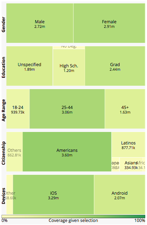
The treemaps on the left of the map are a powerful tool where you can filter and explore the data by gender, age range, education, citizenship, and the kind of device user has.
Click in each treemap's tile to filter the visualization, and again to remove the filter, and the application will dynamically update its visualization as you explore.

2) Refine your selection by geolocation using the map.
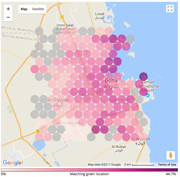
Use either the map or the buttons on the right to select and de-select geographic areas (circles). Each circle is shaded according to the proportion of users who match the demographic selection, with more color meaning higher proportion users matched. Under the map you can find the color scale explaining the extent of concentration portrayed by each color. Additionally, you can find more information about each area in a mouse-over floating window.

3) Explore regional data.
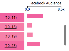
To the right of the map, you can scroll through the listing of all areas (in case you want to find a particular one), as well as select and de-select areas to be included in the visualization. Finally, if you are interested in the data being displayed, you can download the summary statistics of particular selection in .xlsx format using Download Data Summary button.

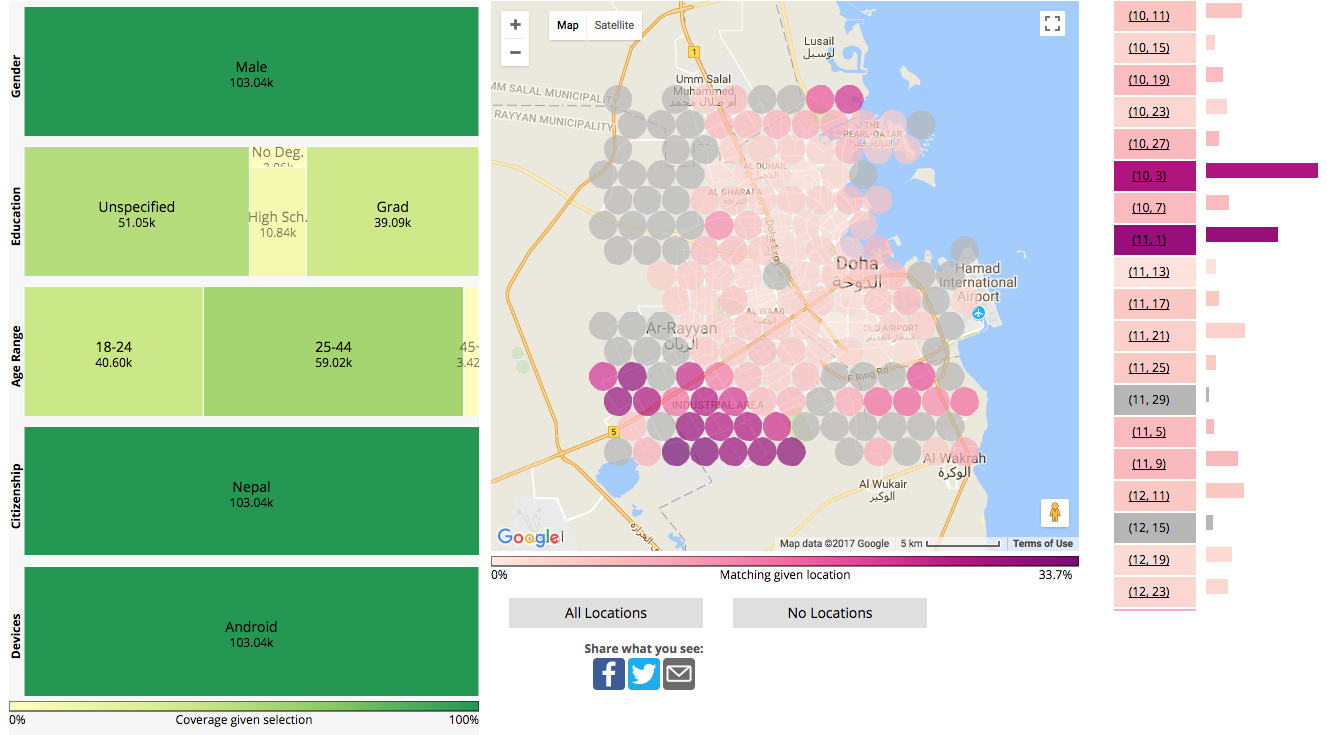
For example, if you want to see the distribution of Android users who are Male and are from Nepal, select these in the treemaps on the left. Judging from the colors on the map, they are mostly concentrated in the bottom left of the map (where an "Industrial Area" of the city is located). Then change the Citizenship selection to India, and you'll find a more even distribution, with the highest at the Old Airport area. To compare the raw data of the two selection side by side, use Download Data Summary.
Click here to see it in the application link.
